

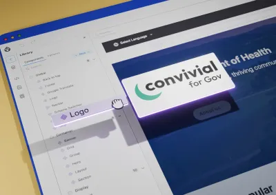
Learn how Convivial for Gov uses Drupal Canvas and pre-built components to help organisations build accessible, scalable websites more efficiently.
Design for what people do, not only what they say
Good design starts with evidence, not opinions about how a site should look. We use interviews, analytics, search terms, and testing with real users, because what people say and what they do can differ.
That matters most on government sites, where your audience spans every age, ability, and level of digital confidence. There's no narrow customer profile to design for, and no room for tricks that push people towards a click. Trust, clarity, and accessibility do the work.
What you get:
- A structure built on research. Your sitemap and navigation follow how people look for information, not your organisation chart.
- Design tested before it's built. Prototypes go in front of real users, so problems are cheaper to fix.
- A design that's ready to build. Wireframes, content models, and site structures feed straight into the Drupal build.
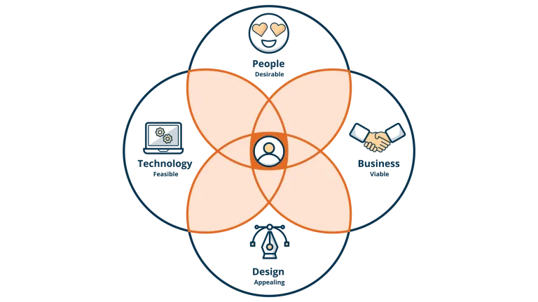
Our approach to UX design
Discover what's needed
We gather your strategy, audience information, analytics, brand guidelines, and content audits, then run a workshop with your stakeholders. Together we define requirements, spot information gaps, and plan next steps to fit your budget and timeframe.

Learn from your users
We talk directly to the people who use your site and check what they tell us against what your analytics show. We then turn the findings into personas, journey maps, and clear problem statements, so everyone agrees on the problem before we talk solutions.

Explore options together
We run co-design workshops with your stakeholders and our cross-functional team to generate as many ideas as possible. The strongest become mood boards, a prioritised feature list, and sitemaps shaped by card sorting.
Design and prototype
We turn ideas into storyboards, wireframes, and interactive prototypes that people can click through. Once the structure works, we apply your brand and style guides to create the visual design.
Test and refine
We test prototypes with real users, from one-on-one interviews to large online surveys, and adjust the design based on what we learn. Testing before launch is the most cost-effective way to catch problems, and we treat it as a cycle, not a final check.
Frequently asked questions
User experience (UX) design shapes how people interact with a website or service: how easy it is to complete a task, and how it feels to do it. The aim is an experience that's useful and pleasant, because that experience influences whether people trust an organisation and take the next step.
Government websites serve a much wider audience: all ages, abilities, literacy levels, devices, and connection speeds. There's no narrow customer profile to design for. Commercial tactics such as false urgency and manipulative design tricks don't belong here either. Task success, clarity, and accessibility carry the most weight.
Morpht approaches government UX research with awareness of the diverse and often complex needs of citizen audiences. Research methods include stakeholder interviews, citizen persona development, content audits, information architecture analysis, journey mapping, and usability testing. The agency has experience designing for audiences with low digital literacy, accessibility requirements, and diverse cultural backgrounds, all relevant considerations for Australian Government services. UX findings are translated into wireframes, content models, and site structures that directly inform the Drupal build.
Information architecture (IA) is the practice of organising and structuring content so that users can find what they need efficiently and accurately. For government websites, which often host thousands of pages across multiple agencies, programs, and audiences, poor IA is one of the most common causes of low user satisfaction and high support enquiry volumes. Morpht's IA work includes sitemap development, content modelling, taxonomy design, navigation strategy, and search optimisation, all grounded in user research rather than organisational hierarchy.
Ideally alongside. UX, content, and structure work should inform each other as the project moves forward. When UX is treated as visual design applied after content and structure are locked in, a site can look finished and still fail people trying to complete a task.
It starts with understanding real user needs and pain points, through analytics, search-term analysis, and user research, rather than a purely visual refresh. From there, it typically covers information architecture, content modelling, and UX design changes informed by that research, implemented on top of your existing (or upgraded) GovCMS platform.
Yes. We regularly work within established design systems, including GOLD (the community continuation of the Australian Government Design System), the NSW Design System, and the Health Design System. We also work alongside in-house teams and design partners.
Case studies

Case study
Morpht built the Australian Hydrographic Office's new GovCMS website on a condensed schedule, making charts, Notices to Mariners and tide tables easier to find.

Case study
Morpht upgraded the AFSA and PPSR websites with new navigation, faster load times and WCAG 2.1 AA accessibility, winning two GovCMS Community Awards in 2025.

Case study
Morpht delivered the Defence and Veterans' Services Commission website in six weeks for its launch, built to WCAG 2.2 AA with a reusable consultation webform.

Case study
Morpht rebuilt the Reef Knowledge System on GovCMS SaaS with a Resource Hub, topic navigation and personalised recommendations. Runner-up in two Splash Awards.
Latest insights

Article
How breaking your hand exposes hidden barriers in everyday workflows and deepened my understanding of accessibility, productivity, and inclusive design.

Article
André Kakos & Matt Commons presented Unifying the UX pipeline at DrupalSouth Community Day, Canberra, 7 November 2025. They highlighted how their UX and UI workflows and processes are unified to deliver efficiencies through the discovery and design phases of a new site build.
Article
The addition of a dark mode feature on your site can improve the accessibility, inclusiveness and aesthetics of the site. Providing users with the ability to select how they view the site will lead to a better user experience for many users.